Tight — Making Slack Usable
Updated: 2019-11-04
I used to enjoy using Slack. It was relatively simple and straightforward, the integrations were powerful and it was continuously improving.
Over the last few years, Slack has turned into a distracting and messy app and many people, including myself, have started looking for alternatives. Upon realizing that most of what I don't like about Slack can be fixed by simplifying and fine tuning the interface, I decided to make a Chrome extension that does just that.
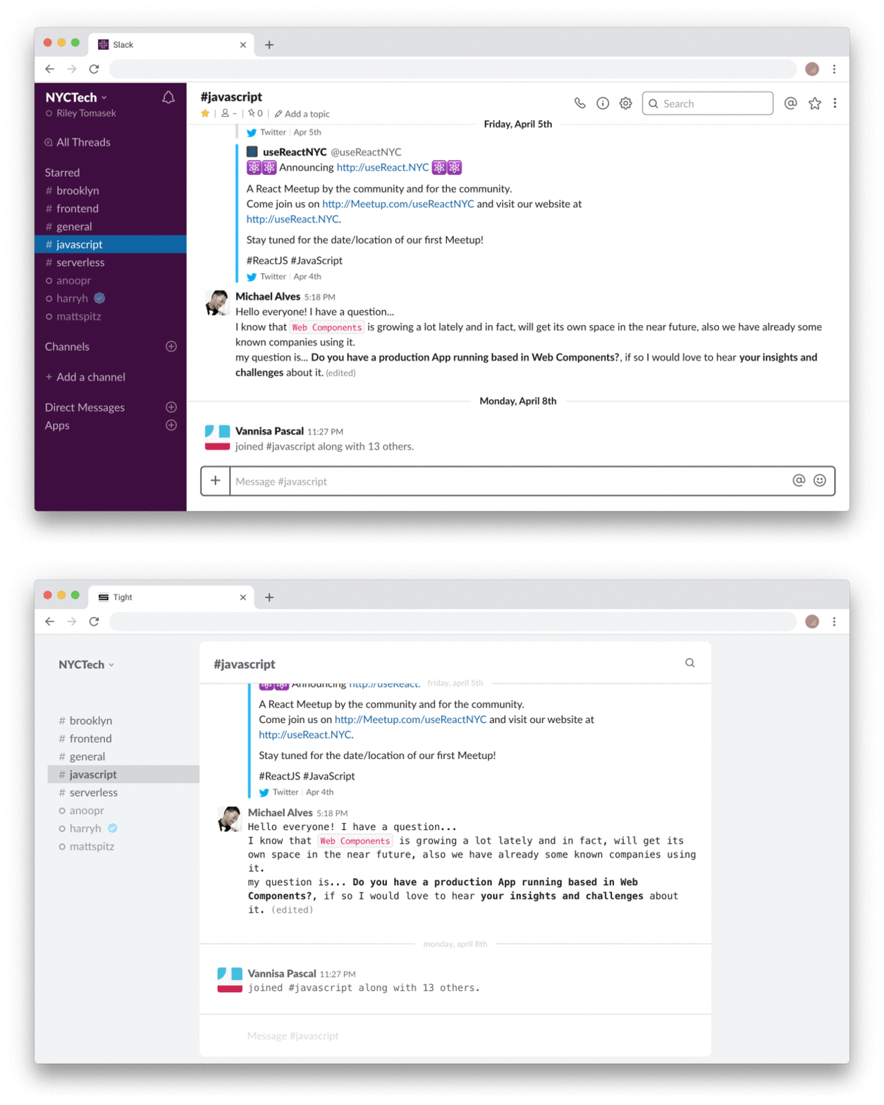
Tight increases readability, removes many redundant/useless buttons, improves the page layout and modernizes the overall style.
Introducing the Tight Chrome extension [source]

Fixed width messages column
All good designers and most savvy consumers are aware that for optimal readability, lines of text should be somewhere between 50-75 characters in length. Slack has no fixed width on the messages column, so on anything other than the smallest of laptops, it becomes very hard to read long messages. Tight solves this issues by setting the messages column to an optimal width for readability.
Focused message drafting
The text area where you enter messages on Slack is crowded with three buttons that are useless to most competent users. You can simply drag and drop files, use the @ character to mention and the system emoji picker to add emoji. Tight removes all of the buttons and modernizes the styling.
A cleaner sidebar
Slacks sidebar is quite crowded with things that I never used. The headers are easily discernible based on the names and icons of the channels/threads and multiple sections like "Apps" are nothing more than a distraction. Tight removes all of the above.
A focused header
The header area above the message column has about 10 buttons that I have clicked on no more than 10 times in several years of using Slack. Further, they are all accessible via the team or channel drop downs, which Tight doesn't remove. Naturally, Tight removes all of these buttons, except search and the channel name.
How it works
Tight does not modify, overwrite, reverse engineer or interact with any of Slack's server or client code. It is purely CSS and impacts only the appearance of Slack in your browser, not anyone else's.
Let's work together!
The current iteration of Tight is just the beginning. If you have any suggestions or ideas, please create an issue or pull request on the Tight GitHub project. I'm confident that we can continue improving Slack together.
Download the Tight Chrome extension

Thanks for reading.
✌️